Our Tale

In the Beginning...
The story of Telltale Studios is one that began with Mackenzie Katsmar, a passionate photographer who sought to make a greater impact not only for PRowl Communications but also for the community. Recognizing the need for a dedicated space that could serve as both a photography studio and a small venue rental, Mackenzie embarked on a search for the perfect location. Since mid-2022, the quest has been ongoing, with a specific vision in mind—character, abundant natural light, and a versatile space that could cater to various creative endeavors. Finally, fortune smiled upon the endeavor when an irresistible opportunity presented itself at 243 Church Street, Unit 208—a historic location with over 100 years of character, inside what once was a cotton factory. This serendipitous find captured the essence of what Telltale Studios aims to be—a space that not only provides a backdrop for visual storytelling but also preserves and showcases the rich and diverse nature of the community.
The process of coming up with the name "Telltale Studios by PRowl" involved careful consideration and a desire to capture the essence of the studio's purpose and offerings. The goal was to create a catchy and memorable name that conveyed the art of storytelling without limiting it solely to photography. The word "Studio" was chosen to reflect the versatile nature of the space, accommodating various creative disciplines, from visual arts to instruction and business events. The term "Telltale" resonated with the team due to its association with revealing stories and the concept of a "telltale sign." This tied directly into the studio's mission of empowering storytellers to share their narratives through different mediums. While attempts were made to incorporate an owl, symbolizing PRowl Communications, it was ultimately decided to include "by PRowl" in the name to create a cohesive connection to the parent company. This combination resulted in the distinctive and evocative name of "Telltale Studios by PRowl."


The Name

The Logo
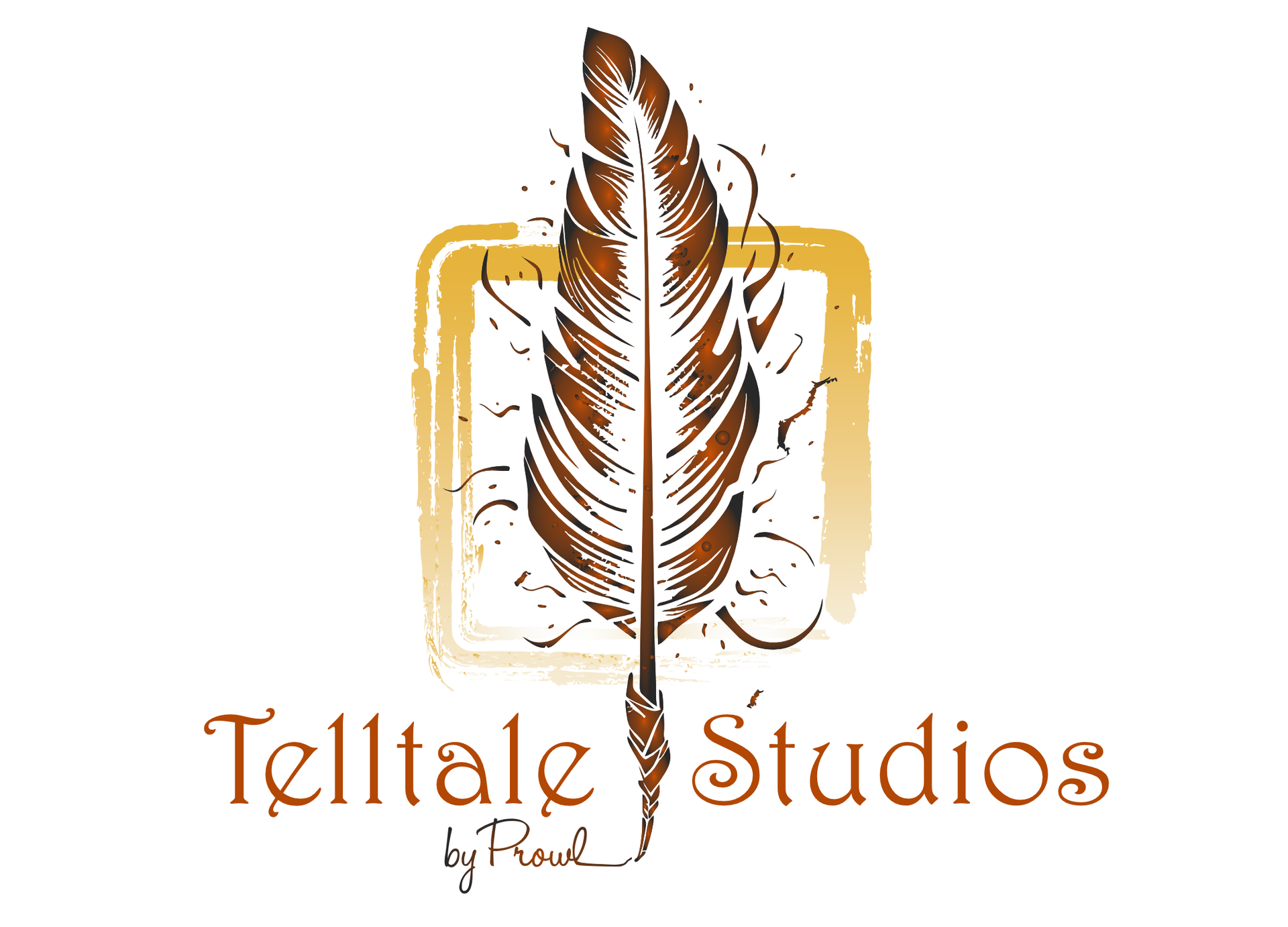
Creating the logo for Telltale Studios by PRowl was an exciting endeavor aimed at crafting a visual identity that not only incorporated elements from the parent company but also stood on its own, telling its own unique story. To achieve this, the logo design team decided to incorporate at least one color from the PRowl Communications brand, ensuring a visual connection between the two entities. However, in order to establish its individuality, a distinct color palette was developed, reflecting the diverse and vibrant nature of the studio. Each color was carefully chosen to evoke different emotions and to symbolize the creativity, energy, and storytelling potential that Telltale Studios embodies. The resulting logo captures the essence of the studio's vision, bridging the connection to its parent company while also crafting its own narrative through thoughtful design and an engaging color palette.
Elements
The evolution of Telltale Studios' logo was a deliberate and creative process, beginning with the selection of fonts that would capture the essence of the brand. The name "Telltale Studios" was brought to life using the Harrington font, chosen for its strong and distinctive appearance, representing the studio's bold and confident nature. For the "by PRowl" part of the logo, the Helohandletter font was selected, adding a touch of playfulness and personality to the design.
Next, the logo incorporated a yellow square element, symbolizing a photo and acting as a frame to encapsulate the story within. This element represents the core of the studio's purpose, emphasizing its commitment to visual storytelling. The square also serves as a visual nod to the digital aspect of photography, reminding viewers of the modern techniques employed.
Identity
Lastly, the logo incorporates a quill, representing the ancient art of storytelling. This element adds a touch of nostalgia and tradition while tying it back to the parent company, PRowl Communications, through the association with an owl feather. Though not immediately recognizable as an owl feather, the thought process behind it was to symbolize wisdom, knowledge, and the connection to the parent company's identity.
The evolution of these elements resulted in a logo that not only captured the essence of Telltale Studios but also showcased its own unique personality. The combination of fonts, the use of the yellow square, and the inclusion of the quill all work together to create a visually engaging and meaningful logo that embodies the studio's commitment to powerful storytelling and its connection to the wisdom of the owl.
Birds of a feather,
flock together.
Where moments unfold, stories are told. Let us help tell your tale!
Join Our Community
| Thank you for Signing Up |


New Paragraph

Hours
- Mon - Thu
- -
- Friday
- -
- Sat - Sun
- Appointment Only
Contact Us

